For this week I decided to put aside the third house for now and focus more on texturing my objects. That was the plan until I realized I still needed to fix the UVs for the small objects that I plan to put into my scene. The lamp post was a bit tedious since I had to UV the frames of the lamps into tiny parts.
When it comes to UVing the fence it was a simple and clean process to accomplish since it is mostly made up of rectangles and did not have any complex geometry.
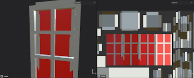
I made sure to clean up the UVs for my door as well. Once again the only tedious process was UVing the frames of the windows but other than that everything went on smoothly.
When putting all the objects into one UV set I made sure to save constantly since ti kept crashing when moving around the UV shells. Overall, I like how it turned out and it definitely utilizes the space in the UV set compared to my previous old one.
I then begun to ID the areas that I want my specific textures to be placed. This makes the process more easier since I do not have to worry about free painting the textures on the models. There was times where I would have to go back and forth to re-adjust the ID maps if I spot something off in Substance Painter. Thankfully this was a simple process to do since all I had to do was simply change the color.
ID Map For Small House
ID Map for Big House
There was times like this where I had to free paint in the black mask to polish up the edges. This is just one of the examples of what I had to go through to achieve my desired textures but in the end the results proved to be worth it.
This is the idea of how I want my textures to look like. I want it not too detailed and just pure and simple. Most of the textures are just basic colors with no height maps and added little details like dirt or wood fiber.
I believe this picture shows what style of textures I am mostly aiming for. I wanted the houses to look simple and clean when I put it in a low poly environment.
I had a bit of trouble deciding to go with what style for this house. In the end I decided to make the top part of the house red with white window frames while the bottom half would be white with red window frames.
Here are the houses I took reference from when texturing my first house. What I love about this house is how the red outlines stands out making it easier to spot the openings and entry ways.
This is the house that I used to reference my second house. I liked the style of how the top half of the house is in contrast with the bottom half of it. i did not like the light red colored roof that it provided so I just went with a blue roof just like the first house.
Since I only have a short amount of time to finish up my work I plan on just working on the changes that my fellow peers recommend to me and if I finish early then I will start on creating a simple environment to put my houses and small props in to show them off.


No comments:
Post a Comment